Students often learn a long list of trend words.
That is useful, but it is not enough.
In IELTS Writing Task 1, you need to describe three things clearly:
- What changed.
- How it changed.
- Where it moved from and to.
If one of those parts is weak, the sentence becomes unclear. Sometimes the vocabulary is correct, but the preposition is wrong. Sometimes the direction is clear, but the speed or size of the change is vague.
Look at these two sentences:
Sales increased.
Sales increased sharply from 4 million to 10 million between 2010 and 2014.
The first sentence is not wrong. It is just incomplete.
The second sentence gives the examiner control: direction, manner, figures, and time.
That is what the two graphics in this lesson are designed to help you practise.
Start With The Direction
First, decide whether the number went up, went down, or stayed the same.
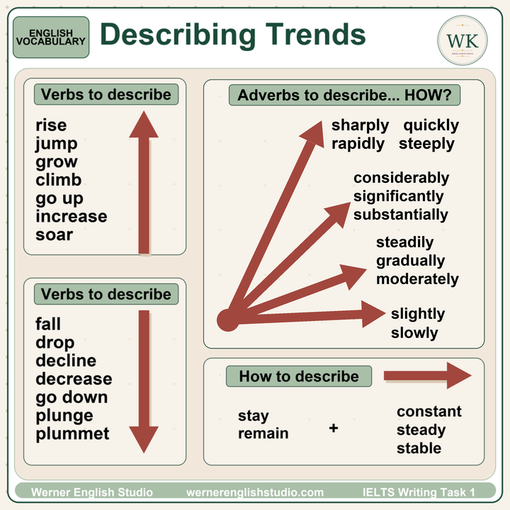
For upward movement, you can use verbs such as:
rise
increase
grow
climb
go up
jump
soar
For downward movement, you can use:
fall
drop
decline
decrease
go down
plunge
plummet
Do not treat all of these words as equal.
Increase and rise are normal academic choices. Soar, plunge, and plummet are stronger. Use them only when the change is large or dramatic.
This is where students often overdo it. A line that moves from 52% to 55% did not soar. It increased slightly.
IELTS does not reward dramatic vocabulary if the data is not dramatic.
Add How It Changed
After the verb, you can add an adverb.
Examples:
Sales rose sharply.
The number of visitors increased steadily.
Prices fell slightly.
The rate declined gradually.
Production dropped rapidly.
The adverb tells the reader how the change happened.
If the line moves fast or at a steep angle, use sharply, quickly, rapidly, or steeply.
If the change is large, use considerably, significantly, or substantially.
If the line changes in a controlled or even way, use steadily, gradually, or moderately.
If the change is small, use slightly or slowly.
Be careful here. These words are not decoration. They must match the graph.
Wrong: The figure increased dramatically from 50% to 52%.
Better: The figure increased slightly from 50% to 52%.
The examiner is checking whether your language fits the data.
Describe No Change Clearly
Not every line goes up or down.
Sometimes the number stays the same. For that, use:
stay constant
remain steady
remain stable
Examples:
The figure remained stable at 6 units.
The number stayed constant between 2010 and 2012.
Sales remained steady for the rest of the period.
This is simple language, but it is useful. Many students ignore flat sections because they want to describe only the big changes. That is a mistake. A flat section can be an important feature of the graph.
Use The Right Prepositions
This is the part students usually lose control of.
The trend verb is only one part of the sentence. You also need the correct prepositions for numbers and time.
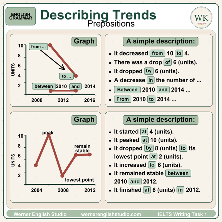
Use from for the starting number.
It decreased from 10 to 4.
Sales rose from 2 million to 8 million.
Use to for the final number.
The figure dropped to 4 units.
The rate increased to 60%.
Use by for the amount of change.
It dropped by 6 units.
Sales increased by 20%.
This difference matters.
It decreased from 10 to 4.
This tells us the start and finish.
It decreased by 6.
This tells us the size of the change.
Do not mix them.
Wrong: It decreased by 10 to 4.
Better: It decreased from 10 to 4.
Better: It decreased by 6.
Use Between And From For Time
For time periods, you have two clean options.
Use between ... and ...
Between 2010 and 2014, the figure fell from 10 to 4.
Use from ... to ...
From 2010 to 2014, the figure fell from 10 to 4.
Both are correct.
But do not write:
Wrong: Between 2010 to 2014...
Right: Between 2010 and 2014...
Right: From 2010 to 2014...
This is a small grammar mistake, but it appears often in Task 1 reports.
Describe Specific Points On The Graph
Some points need special prepositions.
Use at for a specific number or point:
It started at 4 units.
It peaked at 10 units.
It reached its lowest point at 2 units.
It finished at 6 units in 2012.
Use in for a year:
It finished at 6 units in 2012.
The figure peaked in 2006.
Use between ... and ... for a period:
It remained stable between 2010 and 2012.
Again, the grammar is not complicated. The problem is control under pressure. In the exam, students often know the meaning but choose the wrong small word.
Those small words affect clarity.
Build A Complete Sentence
A strong Task 1 trend sentence often has this shape:
Subject + trend verb + adverb + from number + to number + between year and year
Example:
The figure decreased sharply from 10 units to 4 units between 2010 and 2014.
You can also move the time phrase to the front:
Between 2010 and 2014, the figure decreased sharply from 10 units to 4 units.
Both are fine.
Do not make every sentence this long. Use it when the data needs full detail. For smaller points, a shorter sentence is better:
The figure then remained stable at 6 units.
That is enough.
A Simple Practice Method
Take one line from a graph and write three versions.
Version 1: direction only
The figure increased.
Version 2: direction and manner
The figure increased sharply.
Version 3: full detail
The figure increased sharply from 4 units to 10 units between 2004 and 2006.
This practice is boring, but it works because it trains sentence control.
You are not memorising model answers. You are learning how to build accurate sentences from data.
Before You Submit
Check each trend sentence with four questions:
- Did I choose the right verb?
- Did my adverb match the size or speed of the change?
- Did I use from, to, and by correctly?
- Did I use the correct time phrase: between ... and ... or from ... to ...?
If you can control those four things, your Task 1 writing becomes clearer immediately.
You do not need twenty complicated phrases. You need accurate trend vocabulary, correct prepositions, and sentences that match the graph.
That is what the examiner wants to see: control.